Wednesday, January 28, 2015

resist stamping with watercolor...

You know me, I love my watercolors! I'm actually taking a watercolor class right now at Craftsy. Love learning more about this technique!

For today's blog post at Elle's Studio, I've done some stamping with the January stamps (hearts in background) with VersaMark ink, then heat embossed them with white embossing powder. I painted over the top with my watercolor paints starting at the top with a darker, more saturated color, then adding more water to get a lighter color as I painted down the card for an ombre effect!

You can always add more color if it's not dark enough at first! Watercolor paper is an easy medium to work with for blending color.

After dry, I added some Elle's Studio die cuts and wood veneer that I've painted red. Visit the Elle's Studio blog for a complete supply list for these two cards and see a super cute Valentine card by Lisa Dickinson and one by Waleska Neris!

It's been so nice here, almost 70 degrees, so we have been enjoying the sunny, warm break from winter here in Colorado! Hope all is well with you. Happy crafting!

Saturday, January 24, 2015

Photography tips for blogging...

When I first started scrapbooking and perusing blogs, I was amazed at the beautiful, crisp, colorful photos I saw everywhere! I aspired to make my blog photos better over the years. Lately I've been asked quite a bit about my photos: what kind of camera I use, how I get them so bright, if I use a light tent, etc., so I thought I'd divulge a few of my favorite tips with you today. I am by no means an expert, but I've been learning more and more about technology through practice, so I'm hoping this will help you get on the fast track to improving your blog photos without the trial and error I've been through over the years! This is long, but I hope it proves helpful to some of you out there. :)

Tip #1. Invest in a good camera if you can. 
First of all, a good camera makes a world of difference. I can't stress this enough. I have a Canon Rebel XT Digital SLR that I purchased many years ago (maybe about 9-10 years ago now?), and it's been such an asset. I spent around $900 for my camera body and a Tamron lens that shoots 28mm-75mm, perfect for close up shots. Right now I have an 18-55mm lens, also fine for close up shots. I've used my Rebel so much that the paint has literally worn off, can you see it? It's well-loved. A good camera is definitely worth the cost and not only great for your blog photos, but for photos of your family, vacations, and overall a really great investment. Since I've had it so long, it has really only cost me $100 a year if you average out the cost. And it's still going strong! I will admit that lately I've been using my iPhone some. It's so handy. Not as sharp of a picture as the Rebel, but it will work in a pinch. The iPhone camera is really not too shabby. A good editing program also makes a world of difference if you don't have access to a digital SLR camera! More on that in a bit. The photo below was taken with my iPhone.
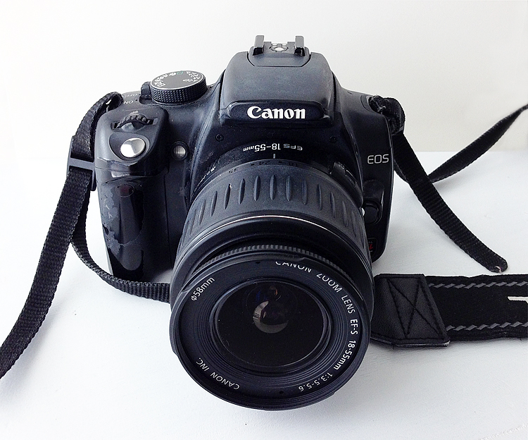
(Canon Rebel XT DLSR)

Tip #2. Use a white background and natural lighting.
Natural lighting is extremely important. There is just something about the warm glow of the sun that makes photos that much better, warmer and more inviting. There are times of day that are better for photographing indoors. For me, it's the warm glow of the afternoon sun that works the best. You always want indirect light for that soft glow you are looking for. Direct sun on a project will cast shadows and create a harsh look, so I try to avoid that. In my scrap room, I have two big windows and have placed my scrap table right up against the windows, so I take my photos right on the table where I create. I like that I don't have to set up a photography area elsewhere, it's right where I'm working, which makes it handy and quick. I've also painted my table white with Benjamin Moore White Semi-Gloss paint, so I can take process pictures right on my work surface as I create "how-tos", and I film my videos here also. You can use poster board to get the white background if you don't have a white table. Putting a piece of white cardstock or poster board on the opposite side of the window also helps reflect the light back onto your project from the window, so you don't get dark shadows on one side of your photos.


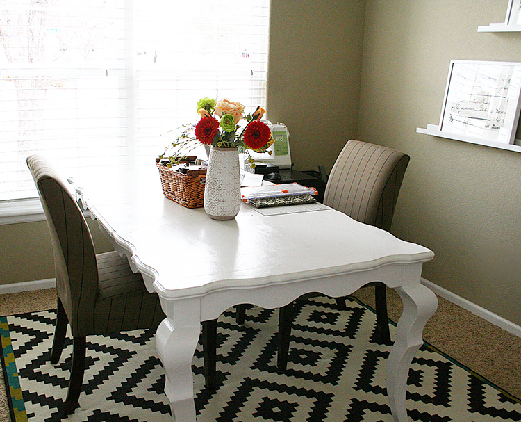
(This is my studio.)

Sunny days are so helpful. Cloudy days can sometimes cast a blue tint to your photos. We are lucky to have lots of sunny days here in Colorado, but if you don't have access to sun, a light tent might be helpful and an Ott-lite. I don't have a light tent and have never used one, so I can't really go into detail about those, but I do know people who use them and swear by them. I do have an Ott-lite.

Tip #3. Take many photos. Play around with different angles. Get close and personal. Fill the frame.
I usually end up taking around 30-40 photos of each project, just to get a few that I love! Snap away! You can always delete the ones you don't like. Move your body around, up, down, to the left and right sides and capture different angles of your project. I also move my project around to get the lighting just right. Depending on what side the window is, you'll have a little bit of a shadow on one side of your project, so sometimes it takes some adjusting. If you are standing a card up, move it forward a bit, away from the backdrop to avoid the card casting a dark shadow on the backdrop. If you are laying the project on the table, move it around and take pics to see where the shadows are being cast. For example, if you have something interesting on the left of your card, you don't want the shadows on that side of the card. Move the card so the light from the window is highlighting the important piece of your card. Below you can see the light is coming from the top of the photo to highlight the pretty details on the top portion of my cards. Fill the frame with a detailed photo of your project for maximum impact.
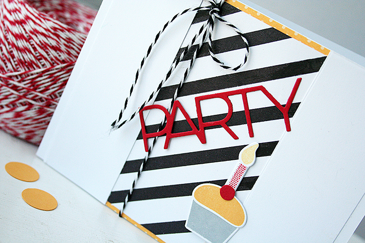
(Sneak peek of cards from my Cards With Dimension class.)

Tip #4. Consider staging and props.
Sometimes a little something in your photo can add color and interest. For example, if I have a white card that doesn't show up very well against a white background, I might add a piece of coordinating cardstock behind it that will flatter the card. Look around your home for little props that will flatter your card and add color to the photo if need be, like this ball of twine. It adds so much texture and color to the photo. You can also use props to create a "Bokeh effect", where the front is crisp and clear and the background is blurred a bit. To get the Bokeh effect, you'll shoot in Aperture or Manual mode, while choosing a f/stop of f/2, f/1.8 or f/1/4. The faster the aperture (lower f/stop number), the more blurred of a background you will get. A higher f/stop number will create a larger area of the photo in focus.

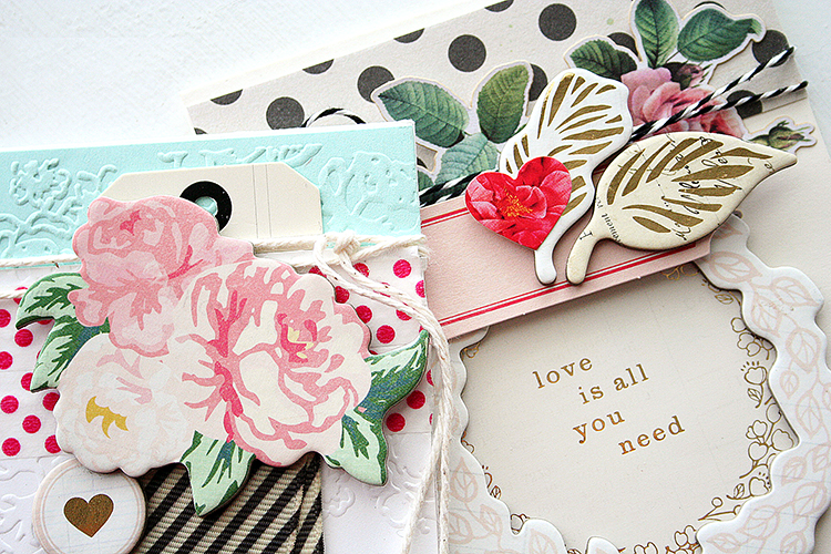
(Another sneak peek.)

Tip #5. Editing is the most crucial part of my process!
Truth is, I edit every single photo to adjust the brightness if need be, sharpen it a bit and sometimes add a tiny bit more saturation and contrast to make the photos pop. My biggest pet peeve is when the photo looks gray and dreary. I want the true colors to shine! I use Photoshop software to edit them, but there are many, many other photo editing programs out there that will work. There's an app called After Light that will allow you to fix exposure, saturation, contrast and brightness. I use one called Snapseed on my iPhone that's free. Gimp is another free photo editing program that you can use for Windows or Mac. Simply play around with it and adjust the levels until you get the look you are going for.

I know you are probably thinking, "that seems really time consuming!" Trust me, it is. Taking photos and editing them are usually more time consuming for me than making the actual project, but good photos are so important to capturing your audience! Good photos make your card or project stand out that much MORE from the rest! I hope these tips were helpful.

Tuesday, January 20, 2015

Cards With Dimension: an online class...

After several months of hard work and patiently waiting for the final result, I'm finally able to reveal something that I worked on feverishly last fall...an online class with Craftsy.com! It's here, it's here! We'll be creating standout cards that are beautifully layered, textured and embellished. I'll offer you tips and tricks to achieve that elegant, professional look to your cards!

(Fancy title, eh? They are so crafty at Craftsy.)
I am going to tell you a little secret! When Craftsy contacted me last fall, and I heard that I would be filmed on camera, my first reaction was, "Oh gosh, no. No, no, no." I'm not really one for being in the spotlight. I'm very quiet and shy (until I get to know you, then I talk up a storm! ha), so for me to go on camera was a huge stretch out of my comfort zone and my little studio at home! I'm much more comfortable being behind the scenes and behind the computer. Maybe I'm just used to it after all of these years of creating and blogging and doing my thing from home! After I gave it some thought... a lot of thought...and talked to my husband about it, he very much encouraged me to go for it. Try something new. Grow. Learn. Take some chances! Put myself out there a bit more. So...hesitantly...I said yes. After all, I love sharing ideas and inspiring others to bring out their creativity!

From that moment on, Craftsy was WONDERFUL to work with. My acquisitions editor worked with me weekly to develop the content and devise an outline of what I was going to teach. We also put together a mini kit that is optional to the class, and of course it is chock full of supplies that I adore! I used everything in the kit on my cards for the class (plus a few other things not in the kit, like some stamps and dies by Papertrey Ink). The great thing is that you can pick one or two items to buy, or you can grab ALL of the items to go with the class! OR you don't have to buy a thing. It's totally up to you. :) If you'd like to follow along and try some of the card ideas, grab a kit. You'll love it! Here's a sneak peek. Click here to see the kit items that I used, available at Craftsy.

In the class, there are approximately 30 never-before-seen projects, and I'll also show several more cards as extra examples of the lesson at the end of each chapter. So all together you'll see over 70 cards throughout the class! (And please...ignore my long, scraggly hair and the scared look on my face! Ha I have cut it short since then! And by the end of the class, I promise I'm not as scared of the camera. Hee)
We'll cover ways to incorporate patterned papers, how to mix and match them and how to layer. And let's be honest: as paper crafters, we all LOVE embellishments! They're fun to work with and make our designs to much more visually appealing. I'll share ideas for incorporating a variety of embellishments for cards that are multi-dimensional and absolutely captivating.
We'll also work with texture in several ways, and I can't wait to show you my process when creating a dimensional card.
Currently, the class is $29.99, however, as a huge thank you to you for being a blog reader of mine, I can offer the class to you for 50% off! YAY! Click HERE to purchase the class for 1/2 price.  You must create a log-in to see the description for the class, I believe. Thank you for letting me share about this journey with you. I'm so grateful for this opportunity to stretch myself, and truly hope you enjoy the class on techniques for creating dimension. xo

P.S. Have you seen the Vibrant Stamping class by Laura Bassen? She's so adorable and fun, you'll love her class!

Danielle

Thursday, January 15, 2015

Valentine pockets...


The January kits at Gossamer Blue were perfect for making "love-themed" projects, so I have some Valentine pockets I've made... great for holding a little treat, love notes, etc.
To make these pockets, I cut a piece of white cardstock 7.5" long x 4.25" high and folded it so that the fold in on the right of the pocket. I added type paper to the front and a piece of pom pom trim in between the layers on the right hand side before stitching. I trimmed the Kiss Kiss- Crate Paper gold heart die cut from January's main Gossamer Blue kit, so it would be off-set a bit on the pocket, wrapped seam binding around the card and tied in a bow on the right side, then finished off with a few more die cuts over the top. And of course some papers, die cuts and goodies tucked inside the pocket. (The Dear Lizzy - Watercolor Words are fun tucked inside! Love these, so much fun!!)
I love the colors this month, aren't they fabulous! Warm and classy.
On the second pocket, I did the same thing with the pom pom trim tucked in on the side before stitching it closed, then added a Watercolor Word and some die cuts and things over the top. A little collage.

Hope this inspires you to layer on your next project! When layering, be sure to choose large, medium and small patterns that coordinate. With the 3 different scales of patterns, it will be sure to be eye-pleasing!
Check out the Gossamer Blue blog also if you haven't stopped by in awhile! The team has more to share with you using the current month's kits, so stop by and check them out:

Release Day: January...

There will be lots of "partying" on my blog today while I share some new products coming out this month at Papertrey Ink! ;) Lots of birthday goodies this month! Everything is available tonight at 10pm EST! First up is Phrase Play #12 stamps and dies.
Using watercolor pencils, I watercolored a background. (Used the same technique that I did on the rainbow hugs card HERE.) When dry, I cut the Phrase Play #12 die out of it. I also cut another one from gold cardstock and layered it over the top. Super easy. Stamped the sentiment when dry.
Thanks For Coming To My Party card:
(All supplies by Papertrey Ink unless otherwise noted.)
STAMPS: Phrase Play #12
INK: Pure Poppy
PAPER: watercolor paper, white cardstock, gold cardstock
DIES: Phrase Play #12
OTHER: watercolor pencils, water, paintbrush.
______

Next is Keep It Simple: Belated Birthday. I used the Phrase Play #12 die again with it. I love, love polka dots. Thought I'd try a more masculine color palette this time.
I used Polka Dot Basics III to stamp the yellow, teal and gray dots. Then added a gold die cut over the top. I made my own striped paper with Background Basics: Super Stripes.

Belated Birthday Wishes card:
(All supplies by Papertrey Ink unless otherwise noted.)
STAMPS: Keep It Simple: Belated Birthday, Polka Dot Basics III, 
Background Basics: Super Stripes
INK: Aqua Mist, Tropical Teal, Harvest Gold by PTI; Soft Granite by Hero Arts
PAPER: White, True Black, gold cardstock
DIES: Phrase Play #12, hole punch
OTHER: none.
______

So...polka dots are my thing! But I love stripes too. And today I love big bold black ones! This one is stamped with Happy Notes (flowers and sentiment) and Background Basics: Super Stripes.

So Happy card:
(All supplies by Papertrey Ink unless otherwise noted.)
STAMPS: Happy Notes, Background Basics: Super Stripes
INK: Tropical Teal, Hawaiian Shores, Aqua Mist, Melon Berry, Berry Sorbet, True Black
PAPER: white, Aqua Mist
DIES: Happy Notes
OTHER: none.
______

More stripes, I couldn't resist. I used Background Basics: Super Stripes to create a panel for the middle and the new Hey, Cupcake stamps and dies.
 "Party" is cut from the new Party Trio dies in Pure Poppy cardstock and layered over the top.
Bold Party card:
(All supplies by Papertrey Ink unless otherwise noted.)
STAMPS: Hey, Cupcake; Background Basics: Super Stripes
INK: True Black, Pure Poppy, Summer Sunrise, Harvest Gold by PTI; 
Soft Granite by Hero Arts
PAPER: White, Pure Poppy cardstock, Summer Sunrise Pattern Pack
DIES: Hey, Cupcake dies and Party Trio dies
OTHER: hole punch, twine.
______

Here is Cable Gram. Such a cool, detailed die! I embossed the die in the background and used the stamps from Cable Gram for my sentiment.
So in love with these fonts! 
To emboss with this die, I simply add 2 pieces of cardstock to the die instead of one, and I take my shim out before running it through the Cuttlebug. I always usually keep my shim in, but for embossing, I remove it. That's it! Works great.
I Just Love You card:
(All supplies by Papertrey Ink unless otherwise noted.)
STAMPS: Cable Gram, Polka Dot Basics III
INK: Sweet Blush, Pure Poppy, True Black
PAPER: White
DIES: Cable Gram
OTHER: none.
______

On this one, I used the new 2015 Birthday Tags and Stitched Swirls, along with Polka Dot Basics III again.
The butterfly is cut from Beautiful Butterflies, then stamped with the dots and sentiment. I cut the holes with Stitched Swirls dies and used the Stitched Swirls stamps to fill it in. Doesn't it look like stitching? To fit with the country/handmade sort of theme, I used some patterned papers from Simple Stories and Studio Calico to add lots of color in the background.
Happy Birthday card:
(All supplies by Papertrey Ink unless otherwise noted.)
STAMPS: 2015 Birthday Tags, Stitched Swirls
INK: Sweet Blush, Pure Poppy, True Black
PAPER: Sweet Blush cardstock, Simple Stories and Studio Calico patterned paper
DIES: Beautiful Butterflies, Stitched Swirls
OTHER: sequins, seam binding.
______

Is there a product you like the best? All of the new products you see here today will be available on Jan. 15 at 10pm EST. Visit the team to see more:

Wednesday, January 14, 2015

Introducing Baker's Dozen...

Baker's Dozen is a new stamp set and coordinating dies by Papertrey Ink that will be released this month on Jan. 15th at 10 pm EST with all the new sets! There is a cupcake for each month in this set, so it's a versatile set that can be used year round.
I do a lot of my shopping at Target, for groceries (and everything else under the sun - love that store!) and happened to come across these little baking cups with lids in the kitchen section. I think there were 4 or 5 of them in the package with lids. You can pour the cupcake batter right in the dish and bake it, but I had better luck with just making the cupcakes and adding one inside with a cute tag on top stamped with Baker's Dozen.
(My cupcake is carrot cake with cream cheese frosting, just in case you were wondering. And yes, I ate 3 of them the day I made these! Ha. Delish.) I used watercolor pencils to color in the pink frosting on the cupcake die cut and markers to color in the red and green portions.
So Sweet of You Tag and Cupcake:
(All supplies by Papertrey Ink unless otherwise noted.)
STAMPS: Baker's Dozen
INK: Pure Poppy by PTI; Soft Granite by Hero Arts
PAPER: White, Sweet Blush cardstock
DIES: Baker's Dozen
OTHER: disposable baking dish - Target, seam binding, markers, watercolor pencils.
______

Next is a card with Aqua Mist cardstock in the background and Baker's Dozen stamped and embossed onto a vellum overlay. 
I used a new die and stamp set called Layered Banner Banter for the big sentiment.  A few mica flakes and a sequin add sparkle and shine.
Celebrate card:
(All supplies by Papertrey Ink unless otherwise noted.)
STAMPS: Baker's Dozen, Layered Banner Banter
INK: Pure Poppy, True Black by PTI; Soft Stone by Hero Arts; Versamark
PAPER: Aqua Mist, White, Vellum
DIES: Baker's Dozen, Layered Banner Banter
OTHER: mica flakes, sequin, Copics R39 Garnet and BG10 Cool Shadow, watercolor pencils (red), green marker.
______

Everything will be available on Jan. 15 at 10pm EST. 
The PTI team has more to show you with Baker's Dozen!

Tuesday, January 13, 2015

Introducing Secret Agent and Zappy Birthday...

Today the Papertrey Ink team is sharing with you some new stamp sets and dies that will be released on Jan. 15th at 10 pm EST! Here is Secret Agent and Zappy Birthday!
I'll admit, I was a little intimidated by these sets, but after I started playing with them, I couldn't believe how much fun I was having. Seriously. SO cute! First are some party glasses for a Secret Agent party. And yes, everything today I'm posting is for GIRLS! Since I have two girls, I'm not as familiar with boy stuff. My girls would love this idea for a party!
The glasses were cut with the new Secret Agent Glasses die. I added some colored acrylic sheets in the centers. The tags were cut with Tremendous Tags and stamped with Secret Agent stamps and dies.

Next, I made some confetti for the center of the party table - I would have everyone sign a little speech bubble for the birthday girl. These were all cut and stamped with the new Zappy Birthday stamps and dies. Of course you could take the pink out and exchange it for red for a boy's party.
Last is a card with Zappy Birthday stamps, dies and papers and the new Cover Plate: Comic Strip die.
I cut the Comic Strip Cover Plate from patterned paper and layerd it over the new Comic Strip paper. Then just cut a few Zappy Birthday sayings and added them over the top.
Secret Agent Party Ensemble:
(All supplies by Papertrey Ink unless otherwise noted.)
STAMPS: Secret Agent, Zappy Birthday
INK: True Black, Tropical Teal, Pure Poppy
PAPER: Comic Strip Patterned Paper, 
Summer Sunrise/Raspberry Fizz/white/Aqua Mist cardstocks
DIES: Secret Agent, Secret Agent Glasses, Zappy Birthday, 
Cover Plate: Comic Strip, Tremendous Tags
OTHER: twine, colored acrylic sheets.
______

Fun, right? Everything will be available on Jan. 15 at 10pm EST. 
Visit the team for more inspiration:

Monday, January 12, 2015

Monthly Moments: January...

Today I'll be previewing the new Monthly Moments products by Papertrey Ink. This is the January collection coming out on the 15th. There is a stamp set full of wintery sayings and soft blues in the journal cards, perfect for scrapping those January days!
Here you can see the Monthly Moments: January Die in action and the new Journal Card 8 die. I love the holes in it, reminds me of little snowballs and would be cute as a shaker card too. I used the Phrase Play #9 die also to cut the snowflakes and "winter" banner from Sweet Blush cardstock. I scattered the little dots that popped out from the Journal Card 8 die around my page.
I chose my favorite journal card to layer under my focal picture, then painted the background of the left side of the page with an aqua watercolor paint to match. Gives it a snowy, blowy feel.
I like to use Glue Dots to adhere the die cuts and give them a tiny bit of dimension, little bit less than foam tape, but just enough. Below you can see a few of the stamps I used by the journaling.
January Winter page:
(All supplies by Papertrey Ink unless otherwise noted.)
STAMPS: Monthly Moments: January
INK: Soft Stone by Hero Arts
PAPER: watercolor paper, white and Sweet Blush cardstock, 
Pure Poppy Pattern Pack, gold foil paper - Silhouette
DIES: Monthly Moments: January, Monthly Moments: Journal Card 8 die, 
Phrase Play #9, Snowflake Medley
OTHER: sequins - Pretty Pink Posh, watercolor paints - Reeves.
______

Here are some little pocket cards that I created with the Monthly Moments January: Journal Cards. You can use these ideas in your cardmaking or make pocket cards for your scrapbooking in between the photos.
I discovered that the Phrase Play #8 die (joy frame) fits perfectly over these journal cards! The "winter" is stamped from the Monthly Moments: January set and then another snowflake cut from Phrase Play #9
Added the January die and some Monthly Moments: January stamping to this one. The glittery dots were cut with the same die that I used above on the scrapbook page. 
January pocket cards:
(All supplies by Papertrey Ink unless otherwise noted.)
STAMPS: Monthly Moments: January
INK: Aqua Mist, True Black - PTI; Soft Granite - Hero Arts
PAPER: Monthly Moments: January Journal Cards, 
Sweet Blush/white cardstock, Pure Poppy Pattern Pack
DIES: Monthly Moments: January, Monthly Moments: Journal Card 8 die, 
Phrase Play #8 and Phrase Play #9
OTHER: Glitter cardstock, sequins - Pretty Pink Posh.
______

Everything will be available on Jan. 15 at 10pm EST. 
Thanks for stopping by! Be sure to visit the rest of the Papertrey Ink team: