
When I first started scrapbooking and perusing blogs, I was amazed at the beautiful, crisp, colorful photos I saw everywhere! I aspired to make my blog photos better over the years. Lately I've been asked quite a bit about my photos: what kind of camera I use, how I get them so bright, if I use a light tent, etc., so I thought I'd divulge a few of my favorite tips with you today. I am by no means an expert, but I've been learning more and more about technology through practice, so I'm hoping this will help you get on the fast track to improving your blog photos without the trial and error I've been through over the years! This is long, but I hope it proves helpful to some of you out there. :)

Tip #1. Invest in a good camera if you can.
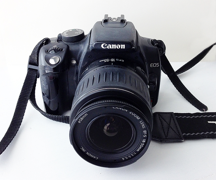
First of all, a good camera makes a world of difference. I can't stress this enough. I have a Canon Rebel XT Digital SLR that I purchased many years ago (maybe about 9-10 years ago now?), and it's been such an asset. I spent around $900 for my camera body and a Tamron lens that shoots 28mm-75mm, perfect for close up shots. Right now I have an 18-55mm lens, also fine for close up shots. I've used my Rebel so much that the paint has literally worn off, can you see it? It's well-loved. A good camera is definitely worth the cost and not only great for your blog photos, but for photos of your family, vacations, and overall a really great investment. Since I've had it so long, it has really only cost me $100 a year if you average out the cost. And it's still going strong! I will admit that lately I've been using my iPhone some. It's so handy. Not as sharp of a picture as the Rebel, but it will work in a pinch. The iPhone camera is really not too shabby. A good editing program also makes a world of difference if you don't have access to a digital SLR camera! More on that in a bit. The photo below was taken with my iPhone.
Tip #2. Use a white background and natural lighting.
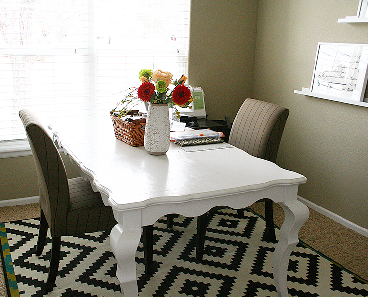
Natural lighting is extremely important. There is just something about the warm glow of the sun that makes photos that much better, warmer and more inviting. There are times of day that are better for photographing indoors. For me, it's the warm glow of the afternoon sun that works the best. You always want indirect light for that soft glow you are looking for. Direct sun on a project will cast shadows and create a harsh look, so I try to avoid that. In my scrap room, I have two big windows and have placed my scrap table right up against the windows, so I take my photos right on the table where I create. I like that I don't have to set up a photography area elsewhere, it's right where I'm working, which makes it handy and quick. I've also painted my table white with Benjamin Moore White Semi-Gloss paint, so I can take process pictures right on my work surface as I create "how-tos", and I film my videos here also. You can use poster board to get the white background if you don't have a white table. Putting a piece of white cardstock or poster board on the opposite side of the window also helps reflect the light back onto your project from the window, so you don't get dark shadows on one side of your photos.
Sunny days are so helpful. Cloudy days can sometimes cast a blue tint to your photos. We are lucky to have lots of sunny days here in Colorado, but if you don't have access to sun, a light tent might be helpful and an Ott-lite. I don't have a light tent and have never used one, so I can't really go into detail about those, but I do know people who use them and swear by them. I do have an Ott-lite.
Tip #3. Take many photos. Play around with different angles. Get close and personal. Fill the frame.
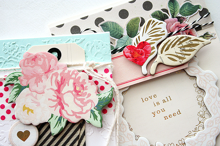
I usually end up taking around 30-40 photos of each project, just to get a few that I love! Snap away! You can always delete the ones you don't like. Move your body around, up, down, to the left and right sides and capture different angles of your project. I also move my project around to get the lighting just right. Depending on what side the window is, you'll have a little bit of a shadow on one side of your project, so sometimes it takes some adjusting. If you are standing a card up, move it forward a bit, away from the backdrop to avoid the card casting a dark shadow on the backdrop. If you are laying the project on the table, move it around and take pics to see where the shadows are being cast. For example, if you have something interesting on the left of your card, you don't want the shadows on that side of the card. Move the card so the light from the window is highlighting the important piece of your card. Below you can see the light is coming from the top of the photo to highlight the pretty details on the top portion of my cards. Fill the frame with a detailed photo of your project for maximum impact.
Tip #4. Consider staging and props.
Sometimes a little something in your photo can add color and interest. For example, if I have a white card that doesn't show up very well against a white background, I might add a piece of coordinating cardstock behind it that will flatter the card. Look around your home for little props that will flatter your card and add color to the photo if need be, like this ball of twine. It adds so much texture and color to the photo. You can also use props to create a "Bokeh effect", where the front is crisp and clear and the background is blurred a bit. To get the Bokeh effect, you'll shoot in Aperture or Manual mode, while choosing a f/stop of f/2, f/1.8 or f/1/4. The faster the aperture (lower f/stop number), the more blurred of a background you will get. A higher f/stop number will create a larger area of the photo in focus.

Tip #5. Editing is the most crucial part of my process!
Truth is, I edit every single photo to adjust the brightness if need be, sharpen it a bit and sometimes add a tiny bit more saturation and contrast to make the photos pop. My biggest pet peeve is when the photo looks gray and dreary. I want the true colors to shine! I use Photoshop software to edit them, but there are many, many other photo editing programs out there that will work. There's an app called After Light that will allow you to fix exposure, saturation, contrast and brightness. I use one called Snapseed on my iPhone that's free. Gimp is another free photo editing program that you can use for Windows or Mac. Simply play around with it and adjust the levels until you get the look you are going for.
I know you are probably thinking, "that seems really time consuming!" Trust me, it is. Taking photos and editing them are usually more time consuming for me than making the actual project, but good photos are so important to capturing your audience! Good photos make your card or project stand out that much MORE from the rest! I hope these tips were helpful.
Tip #1. Invest in a good camera if you can.
First of all, a good camera makes a world of difference. I can't stress this enough. I have a Canon Rebel XT Digital SLR that I purchased many years ago (maybe about 9-10 years ago now?), and it's been such an asset. I spent around $900 for my camera body and a Tamron lens that shoots 28mm-75mm, perfect for close up shots. Right now I have an 18-55mm lens, also fine for close up shots. I've used my Rebel so much that the paint has literally worn off, can you see it? It's well-loved. A good camera is definitely worth the cost and not only great for your blog photos, but for photos of your family, vacations, and overall a really great investment. Since I've had it so long, it has really only cost me $100 a year if you average out the cost. And it's still going strong! I will admit that lately I've been using my iPhone some. It's so handy. Not as sharp of a picture as the Rebel, but it will work in a pinch. The iPhone camera is really not too shabby. A good editing program also makes a world of difference if you don't have access to a digital SLR camera! More on that in a bit. The photo below was taken with my iPhone.
(Canon Rebel XT DLSR)
Natural lighting is extremely important. There is just something about the warm glow of the sun that makes photos that much better, warmer and more inviting. There are times of day that are better for photographing indoors. For me, it's the warm glow of the afternoon sun that works the best. You always want indirect light for that soft glow you are looking for. Direct sun on a project will cast shadows and create a harsh look, so I try to avoid that. In my scrap room, I have two big windows and have placed my scrap table right up against the windows, so I take my photos right on the table where I create. I like that I don't have to set up a photography area elsewhere, it's right where I'm working, which makes it handy and quick. I've also painted my table white with Benjamin Moore White Semi-Gloss paint, so I can take process pictures right on my work surface as I create "how-tos", and I film my videos here also. You can use poster board to get the white background if you don't have a white table. Putting a piece of white cardstock or poster board on the opposite side of the window also helps reflect the light back onto your project from the window, so you don't get dark shadows on one side of your photos.
(This is my studio.)
I usually end up taking around 30-40 photos of each project, just to get a few that I love! Snap away! You can always delete the ones you don't like. Move your body around, up, down, to the left and right sides and capture different angles of your project. I also move my project around to get the lighting just right. Depending on what side the window is, you'll have a little bit of a shadow on one side of your project, so sometimes it takes some adjusting. If you are standing a card up, move it forward a bit, away from the backdrop to avoid the card casting a dark shadow on the backdrop. If you are laying the project on the table, move it around and take pics to see where the shadows are being cast. For example, if you have something interesting on the left of your card, you don't want the shadows on that side of the card. Move the card so the light from the window is highlighting the important piece of your card. Below you can see the light is coming from the top of the photo to highlight the pretty details on the top portion of my cards. Fill the frame with a detailed photo of your project for maximum impact.
(Sneak peek of cards from my Cards With Dimension class.)
Sometimes a little something in your photo can add color and interest. For example, if I have a white card that doesn't show up very well against a white background, I might add a piece of coordinating cardstock behind it that will flatter the card. Look around your home for little props that will flatter your card and add color to the photo if need be, like this ball of twine. It adds so much texture and color to the photo. You can also use props to create a "Bokeh effect", where the front is crisp and clear and the background is blurred a bit. To get the Bokeh effect, you'll shoot in Aperture or Manual mode, while choosing a f/stop of f/2, f/1.8 or f/1/4. The faster the aperture (lower f/stop number), the more blurred of a background you will get. A higher f/stop number will create a larger area of the photo in focus.
(Another sneak peek.)
Tip #5. Editing is the most crucial part of my process!
Truth is, I edit every single photo to adjust the brightness if need be, sharpen it a bit and sometimes add a tiny bit more saturation and contrast to make the photos pop. My biggest pet peeve is when the photo looks gray and dreary. I want the true colors to shine! I use Photoshop software to edit them, but there are many, many other photo editing programs out there that will work. There's an app called After Light that will allow you to fix exposure, saturation, contrast and brightness. I use one called Snapseed on my iPhone that's free. Gimp is another free photo editing program that you can use for Windows or Mac. Simply play around with it and adjust the levels until you get the look you are going for.
I know you are probably thinking, "that seems really time consuming!" Trust me, it is. Taking photos and editing them are usually more time consuming for me than making the actual project, but good photos are so important to capturing your audience! Good photos make your card or project stand out that much MORE from the rest! I hope these tips were helpful.


